There is an old saying that people should not judge a book by its cover.
That sounds nice.
- Very polite.
- Very inspirational.
Also, not remotely how human beings behave on the internet.
Online, people absolutely judge the book by the cover. Then they judge the cover by the lighting. Then they judge the lighting by the crop. Then they judge the whole business because the homepage photo looks like it was taken through a dirty windshield during a thunderstorm.
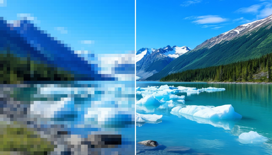
Image quality matters.
In marketing, images are often the first thing people notice. Before they read a headline, before they understand the offer, before they learn about the company history, they see the visuals. A website photo, social media graphic, product image, team picture, logo, banner, ad creative, or Google Business Profile photo can create an impression in a fraction of a second.
That impression can either help the message or make the visitor quietly back away like someone just served gumbo with raisins in it.
Bad visuals create doubt.
A blurry photo may make a business look careless. A stretched logo may make the brand look outdated. A dark image may make the subject hard to understand. A cheap-looking stock photo may make the company feel generic. A badly cropped social media image may cut off the most important part of the message, which is usually not ideal unless the goal is confusion.
And let’s be honest … confusion is already available for free all over the internet.
Image quality is not just about having pretty pictures. It is about trust, clarity, and presentation. A sharp, well-lit, properly sized image tells the viewer that the business pays attention. It does not guarantee the business is great, but it helps the message get a fair chance.
Poor image quality does the opposite. It puts a speed bump between the viewer and the message.
The frustrating part is that many businesses have strong services, good people, and years of experience, but their online visuals do not reflect that. The owner may be excellent at the actual work, but the website images look like they were uploaded from a flip phone that survived Katrina.
That kind of mismatch can hurt perception.
A contractor may do beautiful work, but if the project photos are dark and crooked, potential customers may not see the quality. A restaurant may serve amazing food, but if the food photos look gray and sad, nobody is getting hungry. A professional office may be organized and welcoming, but if the team photo looks like everyone was surprised by a camera in bad fluorescent lighting, the wrong message gets sent.
The internet is not always fair.
People make quick assumptions from limited information. That means visual presentation carries more weight than many business owners realize. If the images look current, clear, and intentional, the brand feels more credible. If the images look random, outdated, or poorly made, the brand can feel less organized.
This applies across almost every platform.
On a website, images help guide attention. A strong hero image can establish tone immediately. Service photos can help explain what a company does. Team photos can create familiarity. Project photos can show capability. Location images can reinforce local presence.
On social media, images often decide whether someone stops scrolling. The post may have a beautifully written caption, but if the visual looks weak, the caption may never get read. Social feeds are crowded. People scroll like they are trying to break a land speed record with their thumb. A good image has to earn the pause.
On Google Business Profiles, images can influence local perception. Someone comparing businesses may look at reviews, location, hours, and photos. If one company has clean, current images and another has three blurry pictures from 2014, the difference can matter.
Even email marketing is affected. A clean image can make a message feel polished. A giant pixelated header can make an email feel like it escaped from a garage sale flyer.
One of the most common mistakes is using the same image everywhere without considering the platform. A wide website banner may not work as a square social post. A vertical image may crop badly in a horizontal ad. A graphic with small text may look fine on desktop but become unreadable on a phone.
And since most people are viewing content on phones, mobile presentation cannot be ignored. If an image only works on a big monitor, it does not really work.
Another mistake is overusing generic stock photos. Stock images have their place. Sometimes they are useful. But when every business uses the same smiling people in the same conference room pointing at the same invisible chart, the brand starts to look like everyone else.
Original images usually feel more authentic. Real team members, real work, real locations, real products, real customers when appropriate, and real environments can make a brand feel grounded. The images do not always have to look like a magazine shoot, but they should look intentional.
Lighting matters. Composition matters. Cropping matters. Resolution matters. Consistency matters.
Even small improvements can make a big difference. Clean up the logo files. Update old team photos. Take better project pictures. Use correct image sizes. Stop stretching graphics. Make sure faces are not cropped at the forehead. Avoid text so tiny it requires a jeweler’s loupe. Check how everything looks on a phone.
That last one deserves repeating.
Check the phone.
A website can look fantastic on a desktop screen in an office and still look like a digital junk drawer on mobile. Since customers are often browsing while sitting in a truck, standing in line, waiting at a red light, or pretending not to be bored at a meeting, mobile image quality matters.
At Jambalaya Marketing in New Orleans, visual presentation is always part of the conversation because branding is not just what a company says. It is what people feel when they see it. A business may intend to communicate professionalism, warmth, experience, creativity, or reliability, but the images have to support that message.
A brand is built through repeated impressions.
One image may not make or break everything. But a pattern of good visuals can build confidence. A pattern of poor visuals can create hesitation.
And in marketing, hesitation is dangerous.
When a potential customer pauses for the wrong reason, the opportunity can disappear. Not because the service was bad. Not because the company lacked experience. But because the first impression did not give the message enough room to breathe.
Image quality is not decoration.
It is communication.
It tells people whether the business is current, careful, organized, and paying attention. It supports the words, strengthens the message, and helps the brand feel real.
So yes, people judge the book by the cover.
- They judge the website by the photos.
- They judge the company by the graphics.
And if the logo looks like it got resized with a garden rake, they are definitely judging that too.
