Let’s talk about color. Not in a Bob Ross, “happy little tree” kind of way—but in the way that makes your brand stick in someone’s head like the chorus of a bad pop song. If you’re in business and still picking colors like you’re painting your first apartment in college, it might be time to reconsider. Beige might be “safe,” but it’s also one step away from disappearing into the digital void.
Color is emotional. It’s psychological. It’s science. And yes, it’s marketing. People think branding is just logos and fonts, but in reality, color is the first thing your audience sees… and judges. It’s a snap decision. It’s the silent handshake before anyone even reads a word on your website or clicks your ad.
Picture this: someone lands on your homepage. You’ve got two seconds before they decide whether you’re a trustworthy business or an amateur hour side hustle operating out of a spare bedroom next to a litter box. That decision? It starts with the colors you chose.
Color psychology isn’t voodoo—it’s just how the human brain works. Certain colors have built-in associations. Blue? Trust, professionalism, calm. That’s why half the internet is blue. Banks love blue. Hospitals love blue. Tech companies practically bathe in it. Want to look credible? Go blue. Want to look too credible? Go blue and Helvetica, and suddenly you’re running a Swiss pharmaceutical company.
Now take red. Red gets attention. It yells. It says “sale,” “danger,” or “spicy.” It’s bold, it’s fast, and it doesn’t whisper. It’s the marketing equivalent of someone kicking the door open and saying, “LOOK AT ME.” Restaurants love red because it triggers appetite. That’s right—color can make people hungry. (Maybe that explains my late-night cravings every time I pass a Popeyes sign.)
Green? Growth, nature, money. If your business has anything to do with wellness, eco-friendly products, or reminding people of springtime in City Park, green’s your color. Just avoid pairing it with brown unless you want your brand to look like an overripe avocado.
Black is luxury, authority, sleekness. It’s the tuxedo of branding. Use it wrong, though, and your site might look like it’s selling high-end caskets. Use it right, and you’re suddenly James Bond with a shopping cart.
Of course, there’s also yellow, the wildcard. It’s cheerful, optimistic, and great for grabbing attention—but it can be hard to read on a white background unless your target customer is an eagle. Use it as an accent, not a paragraph color, unless you’re deliberately trying to give your visitors a headache.
Let’s not forget purple. It’s the color of royalty, mystery, and sometimes grape soda. It’s not for everyone, but it can work wonders if your brand wants to feel a little offbeat, creative, or spiritually inclined. Just don’t combine it with neon green unless your business is a 90s roller rink.
And yes, pink still gets stereotyped, but it’s evolved. It can be bold, rebellious, modern, or playful—depending on the shade and the context. Hot pink is not the same as dusty rose. One belongs at a punk show, the other on a wedding invite. Choose wisely.
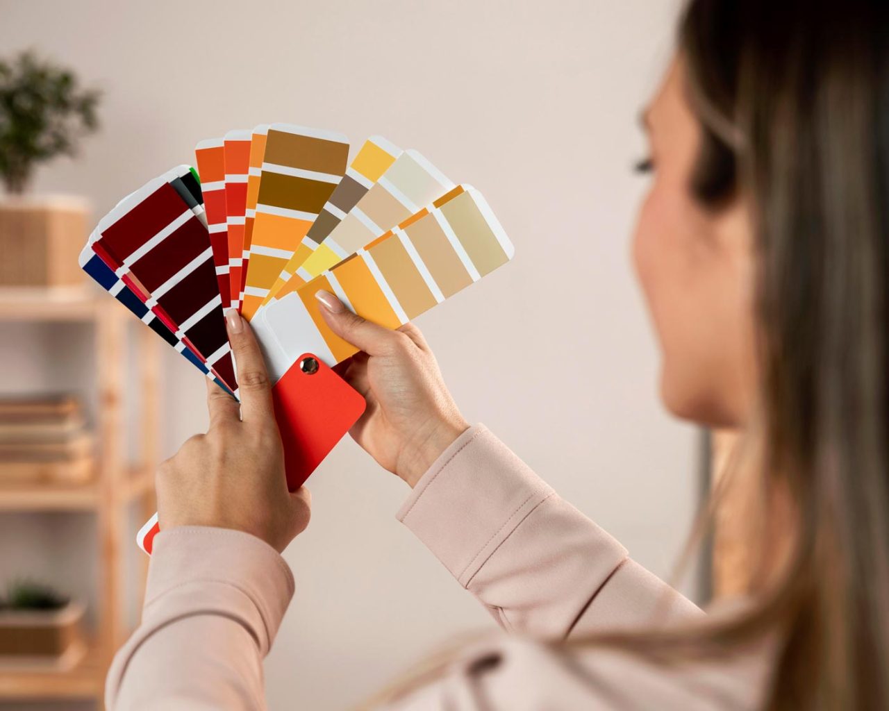
But here’s the thing: colors don’t exist in a vacuum. It’s not just about picking one that “feels right” and calling it a day. Colors work together. They form a palette, a visual language. If your website looks like a Mardi Gras float crashed into a fireworks stand, customers are going to be too confused to click anything. (Unless you are a Mardi Gras float company. In which case, go wild.)
Contrast matters. Accessibility matters. And consistency? That’s the secret sauce. Your brand colors should live everywhere—on your website, social media, print materials, and even the sign hanging on your front door. If your logo is teal and gray on Facebook but orange and brown on your business cards, it’s like showing up to a wedding in a tuxedo and flip-flops. No one knows what to make of you.
Now, trends are fun—but dangerous. Just because Pantone picked “Peach Fuzz” as the color of the year doesn’t mean it belongs in your brand. Trends fade. Brand recognition lasts. So unless your business depends on staying fashion-forward, stick to colors that reflect your identity—not what’s hot on Instagram this week.
Color can drive action, too. That “Add to Cart” button? It shouldn’t blend in. It should be screaming for attention without giving people a seizure. There’s a balance to strike between visibility and subtlety. Kind of like yelling across a crowded bar but doing it in French so it sounds classy.
So, what’s the right palette for your brand? That depends on who you are, what you do, and who you’re trying to reach. A law firm in Baton Rouge probably shouldn’t lean into neon pink and lime green. A snowball stand in Metairie? Now we’re talking.
Bottom line: color isn’t decoration—it’s communication. It’s how your brand speaks before your mouth opens. It’s mood, tone, and first impression rolled into one. Choosing the right colors isn’t just a design task—it’s a business decision.
At Rhino Web Studios, it’s something baked into every branding conversation we have. Because a good brand doesn’t just look good—it feels right. And when the colors are dialed in, everything else falls into place. Even your bounce rate.
Just don’t ask me to build your site in Comic Sans purple. There are limits, even in New Orleans.
